|
The powerpoint disease March 2004 |
|
The powerpoint disease March 2004 |
| Giancarlo Livraghi gian@gandalf.it |
|
| |
||
Many of today’s diseases can be traced back to the origins of our species. It’s easy to imagine a prehistoric painter, who had found a quick and easy way of drawing a buffalo, covering cave walls with colorful celebrations of hunting success, regardless of his actual competence in bringing home food for his family or his tribe.
The “powerpoint syndrome” is a well known disease, clearly diagnosed not only by brilliant cartoonists such as Scott Adams, but also in a variety of analyses of corporate efficiency and communication.
It’s called “disinfotainment”. It has been found that it can seriously disrupt corporate communications. Some companies, including Sun, have banned it from their organization. In the September 2003 issue of Wired magazine there was an article Power Corrupts, PowerPoint Corrupts Absolutely by Edward R. Tufte, professor emeritus at Yale. His monograph, The Cognitive Style of PowerPoint, is available from Graphics Press. His article PowerPoint Makes You Dumb was published by the New York Times Magazine in December 2003.
Here are a few quotations from his interesting comments.
Imagine a widely used and expensive prescription drug that promised to make us beautiful but didn’t. Instead the drug had frequent, serious side effects: it induced stupidity, turned everyone into bores, wasted time, and degraded the quality and credibility of communication. These side effects would rightly lead to a worldwide product recall.
Yet slideware – computer programs for presentations – is everywhere: in corporate America, in government bureaucracies, even in our schools. Several hundred million copies of Microsoft PowerPoint are churning out trillions of slides each year.
Slideware may help speakers outline their talks, but convenience for the speaker can be punishing to both content and audience. The standard PowerPoint presentation elevates format over content, betraying an attitude of commercialism that turns everything into a sales pitch.
Presentations largely stand or fall on the quality, relevance, and integrity of the content. If your numbers are boring, then you’ve got the wrong numbers. If your words or images are not on point, making them dance in color won’t make them relevant. Audience boredom is usually a content failure, not a decoration failure.
At a minimum, a presentation format should do no harm. Yet the PowerPoint style routinely disrupts, dominates, and trivializes content.
The practical conclusions are clear. PowerPoint is a competent slide manager and projector. But rather than supplementing a presentation, it has become a substitute for it. Such misuse ignores the most important rule of speaking: respect your audience.
Of course presentation tools existed long before electronics. There were blackboards, slides, etcetera. Some of the most beautiful paintings and sculptures of all times were used to present or support an idea, a way of thinking, an attitude, a project or an action plan. But most of today’s powerpoint presentations can’t be called a work of art – or even an example of effective presentation.
Visual aids can be used effectively. To focus on key points, to emphasize relevant data, to make things clear. But it’s unfortunately easy to do the opposite – to muddle, to confuse or to deliberately warp facts, issues and concepts.
We know that data, balance sheets, statistics, trends, projections and forecasts can be manipulated in many ways. Fifty years ago this was explained very clearly in a wonderful little book by Darrell Huff: How to Lie with Statistics. It was published in 1954, it’s still being reprinted, and it’s as relevant today as it has ever been.
Darrell Huff explained how data can be misused and misrepresented – by mistake or by deliberate manipulation. He also showed how they can be additionally warped in a visual presentation. For instance numbers can be shown using two-dimensional shapes instead of lines, columns or bars. The height of the picture indicates the actual quantity, but the perception of difference or change is twice as large.
By using pictures the effect can be even stronger. The perception is three-dimensional. If we use the picture of an animal to show the increase or decrease of a species, or a cow to represent milk production, we can make it appear doubled when it actually increased 30 percent. And further misperceptions can be added by using movement.
Can that be done with money? Yes, of course. Instead of figures or bar charts one can use banknotes, coins or moneybags. It’s called “dramatizing”, but it’s cheating – as Darrell Huff explained fifty years ago, when there was no electronic slideware to make it easier.
Visual resources, as such, aren’t honest or misleading. They are tools – and the result depends on how they are used. A well planned presentation can be “truth well told”. But if it’s deliberately manipulated it can be a cheating device – or, if it isn’t carefully planned and tested, its effect can be quite different from what the presenter had in mind.
Standardized tools and styles can make things even worse. Presentations follow a predefined pattern, bore the audience with repetitive mannerisms instead of catering for its interests and questions.
An effective presentation needs serious work, care, competence. It needs to be tried and tested, finding the most effective form for its specific content, with precise coherence of visual and textual devices to its intent and purpose.
Even when technical resources were less easy and more expensive (costing time, care and commitment as well as money) there were mistakes and mishaps – as well as deliberate cheats. But it didn’t happen as often as it does now, because more effort and specific competence were needed for its preparation. Things are made worse by the powerpoint intoxication.
It seems so easy. An elaborate show can be put together in a few hours. The abundance of tricks and devices encourages exaggeration. The result is often depressing.
The resources offered by standard slideware are always the same. As a result presentations often look the same, though they are dealing with totally different subjects. That is confusing and boring.
We often see a presenter, imprisoned in a predetermined format, unable to answer a simple question. Because he or she is trained to repeat, without any depth of understanding, a presentation put together by someone else. Even when people prepare their own presentations, they often get lost in the mechanics of form and format – and miss the point of what they were supposed to say.
Another ridiculous consequence is that, after a meeting or a convention, instead of a written document what is left behind is a copy of the slides. It’s obvious that slides prepared to support a presentation are not the appropriate format for reading – and lack depth of explanation and information. But haste, habit, and mindless subjugation to technology lead to the production of useless papers that confuse the issue (even when they are not deliberately deceiving).
There are also messy results of “personalization”. It’s easy, with word processing, to change a name. Too easy. A document (or presentation) that on page 1 shows the name of a person, or a company, in the publishing business reveals on page 12 that it was originally written for a car dealer.
Things get worse in the case of online communication. It’s annoying enough to receive a three megabyte powerpoint attachment to tell us something that could have been said more effectively in six lines of plain text. But there are also websites that contain materials poorly adapted from something that had been obviously prepared for another purpose. In addition to the well known and widespread disease of cosmetics prevailing on content.
After many years of serious discussion about usability and content management, the best website makers know that substance matters more than appearance. (See The architect and the gardener.) But many site owners want things done poorly. Because they don’t understand that the internet isn’t television. Or because they are infected by the powerpoint bug. Or because they don’t want to commit manpower to produce meaningful content. So we are still plagued with a proliferation of empty boxes, shiny appearances with nothing inside.
The powerpoint syndrome isn’t just the misuse of specific technology. It’s a cultural disease. The abundance of resources for makeup and glitz leads to exaggeration and superficiality. Where appearance prevails on substance, scams and cheats are more easily disguised. We must learn to tame the wild proliferation of expressive tools to bring them to obedience, to the service of what we have to say. If and when there is something that is really worth saying.
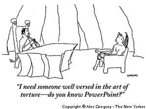
The subject is effectively summarized in this cartoon by Alex Gregory published in The New Yorker on September 29, 2003.
Post scriptum – seven years later
September 2011
Time goes by, the problem remains. Of course powerpoint, as other technologies, can be used reasonably and effectively. But we are still plagued with the obnoxious prevaililing of technical tricks over content and meaning.
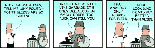
In the ever continuing series of his “Dilbert” strips, Scott Adams has dealt several times with the powerpoint disease. In this one, September 11, 2011, he is deliberately connecting it with garbage.
Copyright © 2011 Scott Adams
And also...
September 2012
There are lots of comments on this subject. But here is one that I find particularly interesting (not only because it’s amusing).
PowerPoint was released by Microsoft in 1990 as a way to euthanize cattle using a method less cruel than hitting them over the head with iron mallets.
After PETA [People for the Ethical Treatment of Animals] successfully argued in court that PowerPoint actually was more cruel than iron mallets, the program was adopted by corporations for slide show presentations.
Conducting a PowerPoint presentation is a lot like smoking a cigar. Only the person doing it likes it. The people around him want to hit him with a chair.
Damien Morton